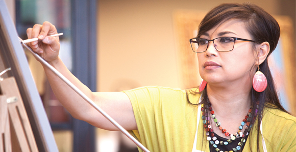
Rose Datoc Dall is one of our truly world-class artists. Her touching subject matter, the creative compositions, the sheer quantity of work, and the colors–the colors! Dall, a Filipina-American, was born in Washington, D.C. and received a BFA from Virginia Commonwealth University. Dall lives with her husband in Virginia.
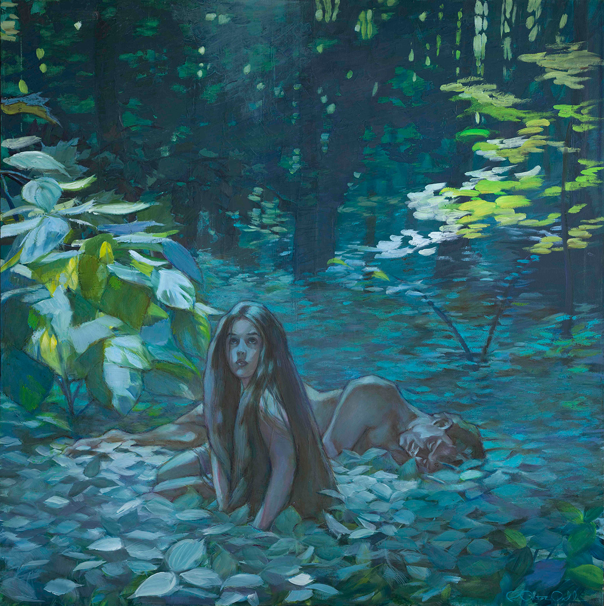
Your expert use of color is often breathtaking. Thank you so much. My art really is all about color. I had someone ask me if I would ever reproduce and sell prints of my art in sepia tones or in black and white. The answer is unequivocally, “NO!” My art without color loses its purpose. It would take away the thing which gave it any life. The genesis for every image revolved around color and if I could get away with some figures in some crazy color scheme. I heartily accept the challenge each time.
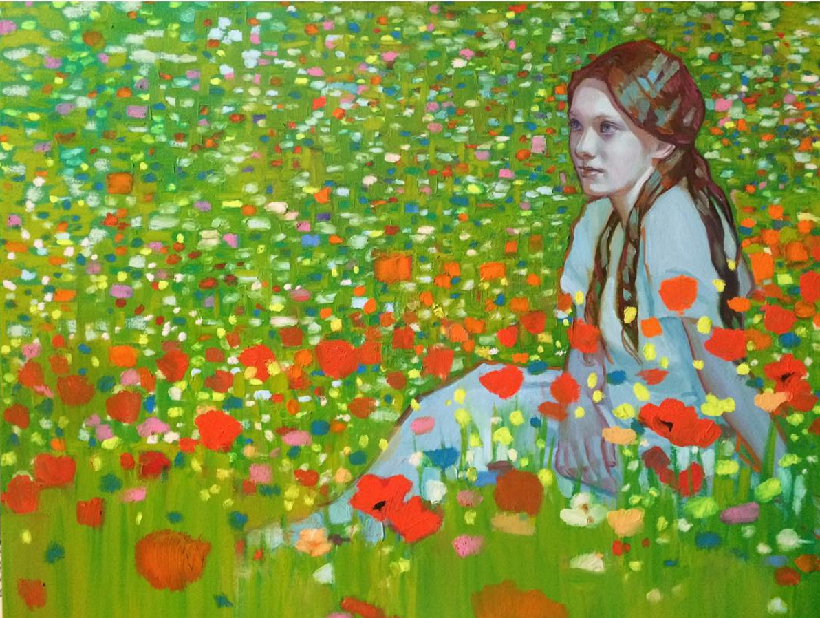
Using color to transform something ordinary into extraordinary is what excites me. I’ve had people ask me if there is a formula that I use, and the answer is “no,” not a formula per se, but a principle of visual balance. I love using complimentary colors, subtly, and boldly, consciously and unconsciously. I often let color become its own thing and just let the magic happen. A painting starts usually very carefully planned, a general vision of shapes, color relationships, and composition, but then I let it go, and hopefully it becomes an intuitive process. I am constantly nudging these color relationships as I lay down my strokes making sure as I go that everything jives correctly in the same ‘color universe’. Can I coin that phrase? I often use that term because my color universe does not necessarily relate to the natural world, but yet, I hope that the color universe created in each painting still manages to work. Moreover, it is really all about balance.
For example, a cool bluish skin tone can be balanced off by introducing a red or pinkish tone along an edge, or in the cheeks, the nose, or fingertips to give it warmth. I pay particular attention to lighting, throwing a cool temperature light on a subject, and then maybe balancing it out with a warm light coming from somewhere else if it needs it. That may be as close to formulaic as I get, but then I like to alter it, and maybe do things a little differently so as not to become old hat.
Surprisingly to some, my palette is kind of limited to a handful of dominant colors. That palette dominance may shift slightly from painting to painting, depending on the overall color scheme (for instance some paintings may be a mustard/pale blue scheme, or an orange/turquoise scheme, or maybe a crazy green/blush pink scheme) but largely I have my go-to colors. Remember, that all my color relationships MUST sit in the same color universe and let’s say introducing a color at random, that I haven’t introduced early in the process (just for the sake of riotous color) just doesn’t make sense. Simplicity, simplicity, simplicity. Keep with basics of form and color and shape. Keep your values, intensity and relationships of these tones in balance.
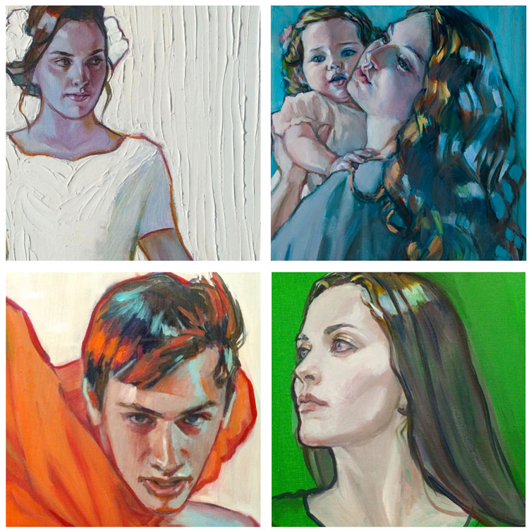
People have asked me if my pieces are watercolors. No, they are oil. But I often incorporate R&F Pigment Sticks (a buttery oil stick) because I love the color intensity in their pale tones, which can be hard to achieve when lightening up a color with titanium white or Permalba white which tend to gray or dull the intensity. Using R&F Pigment Sticks has the immediacy and effect of drawing with pastels, but rather it’s oil paint. Yummy, buttery oil. Think drawing with a tube of lipstick. (Okay, if you want to be technical, they are really encaustic pigments, but they blend will with oil paint.) There’s my nod to Edgar Degas, my first major art crush when I was age seventeen. The immediacy of which he laid down his strokes in his pastel work, his use of colors, his masterful rendering of figures, and his brilliant compositions, completely lit my fire and fueled my imagination. Henri De Toulouse Lautrec took this effect even further, and I have heartily embraced this approach to color.
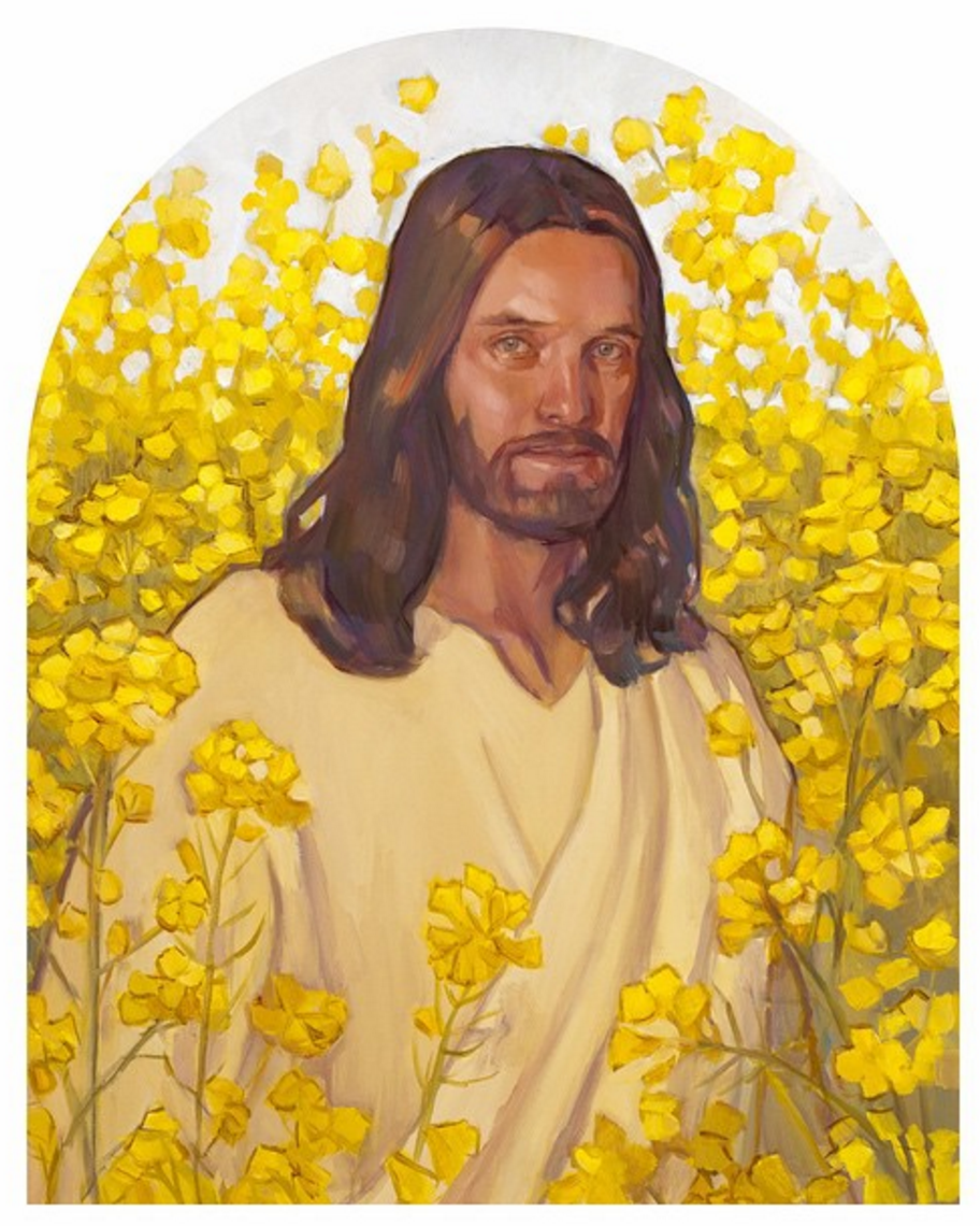
What’s next for you? I guess I am always working on several series at a time, in a continuum fashion. I will continue to paint images of Christ. Having painted multiple paintings from the ‘Early Years of the Savior’ (painted over a decade, from the viewpoint of a mother, Mary), I have moved onto ‘Christ’s Ministry Years’. At least twenty new images immediately come to mind. Who knows if I will live long enough to paint them.
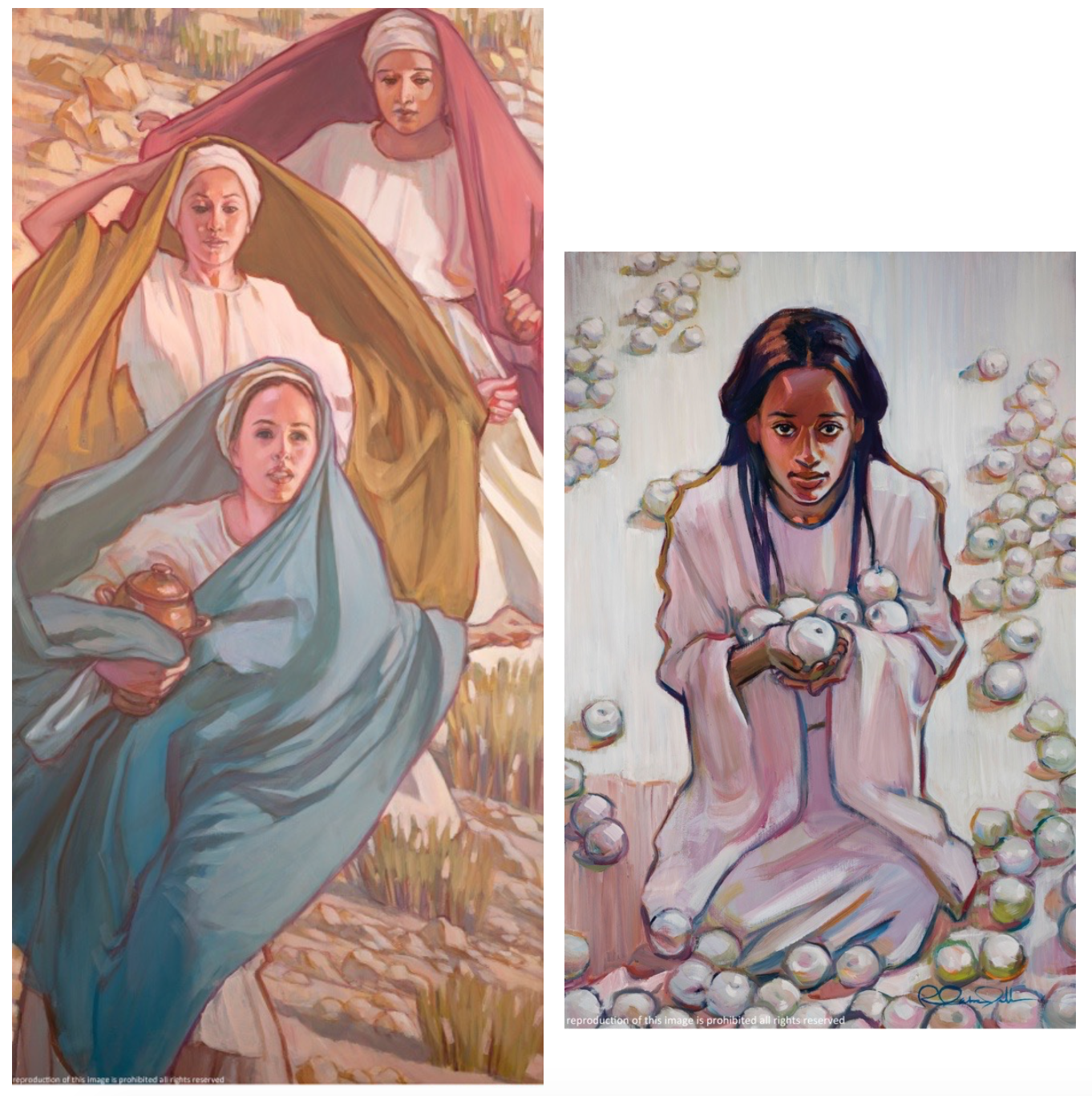
I also, of course paint women. Being a female artist, I relate to women. I am currently painting a series called ‘Girls in White Dresses’. These are girls and women of all ages and races. The series is about the purity of womanhood and girlhood, undiminished by stereotypes, removed from their association as sexual objects. These are real women, dressed in blinding white, in all their glory, and indomitable in spirit. With all that white, instead of exploring tonal values, I chose to use texture in a field of white on white, much like the effect of bas relief.
So what is next? What you will most likely see will have evolved from a continuum of images, and I hope new strains will emerge. And of course…. there will be LOTS… and LOTS… of color.
Visit Rose Datoc Dall’s website.
Follow Rose Datoc Dall on Instagram.
Images courtesy Rose Datoc Dall and LDS.org.