All posts by Garrick Infanger

Rose Datoc Dall: A Color Universe

Screen Shot 2015-11-10 at 11.57.55 PM

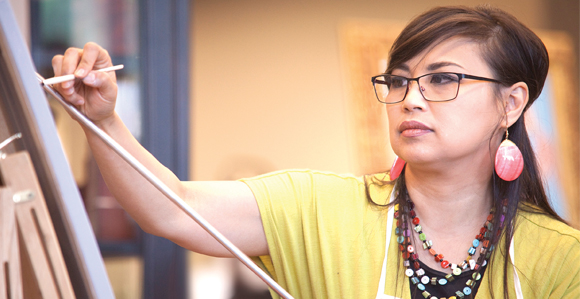
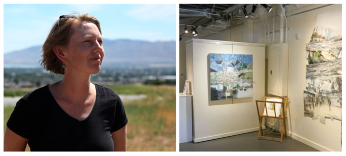
Rose Datoc Dall is one of our truly world-class artists. Her touching subject matter, the creative compositions, the sheer quantity of work, and the colors–the colors! Dall, a Filipina-American, was born in Washington, D.C. and received a BFA from Virginia Commonwealth University. Dall lives with her husband in Virginia.

RDD1RDD@Screen Shot 2015-11-20 at 12.16.15 AMrose-datoc-dall-06

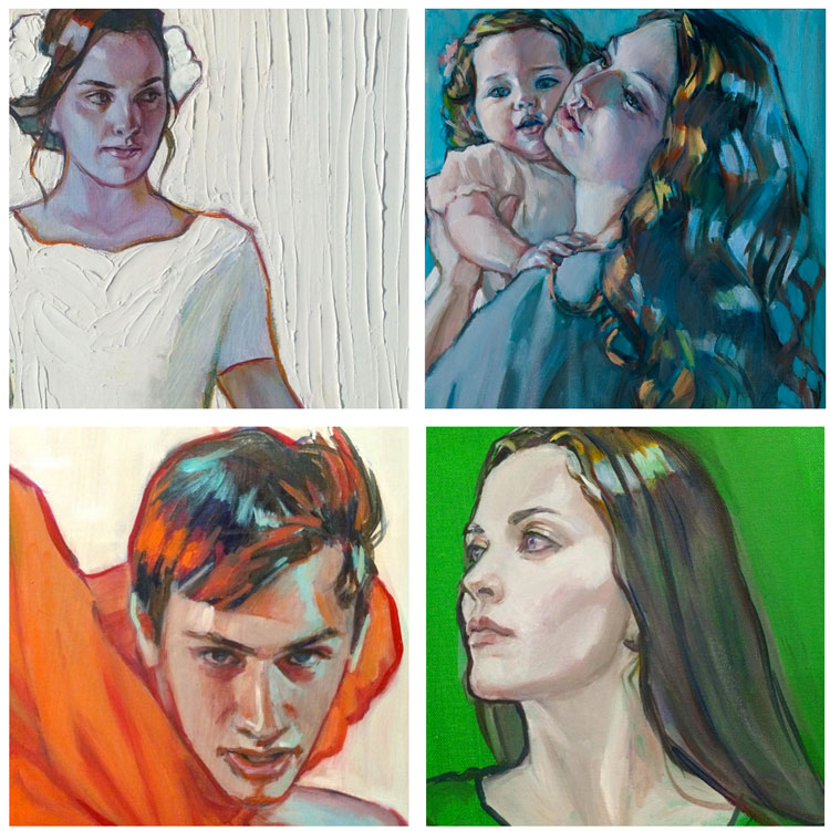
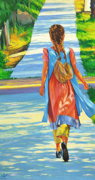
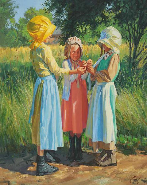
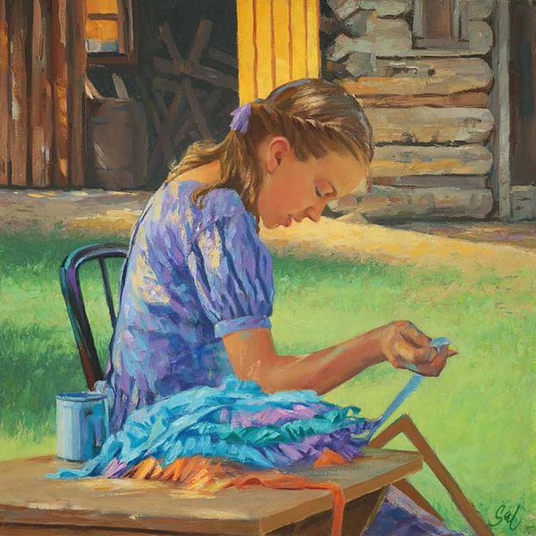
Your expert use of color is often breathtaking. Thank you so much. My art really is all about color. I had someone ask me if I would ever reproduce and sell prints of my art in sepia tones or in black and white. The answer is unequivocally, “NO!” My art without color loses its purpose. It would take away the thing which gave it any life. The genesis for every image revolved around color and if I could get away with some figures in some crazy color scheme. I heartily accept the challenge each time.

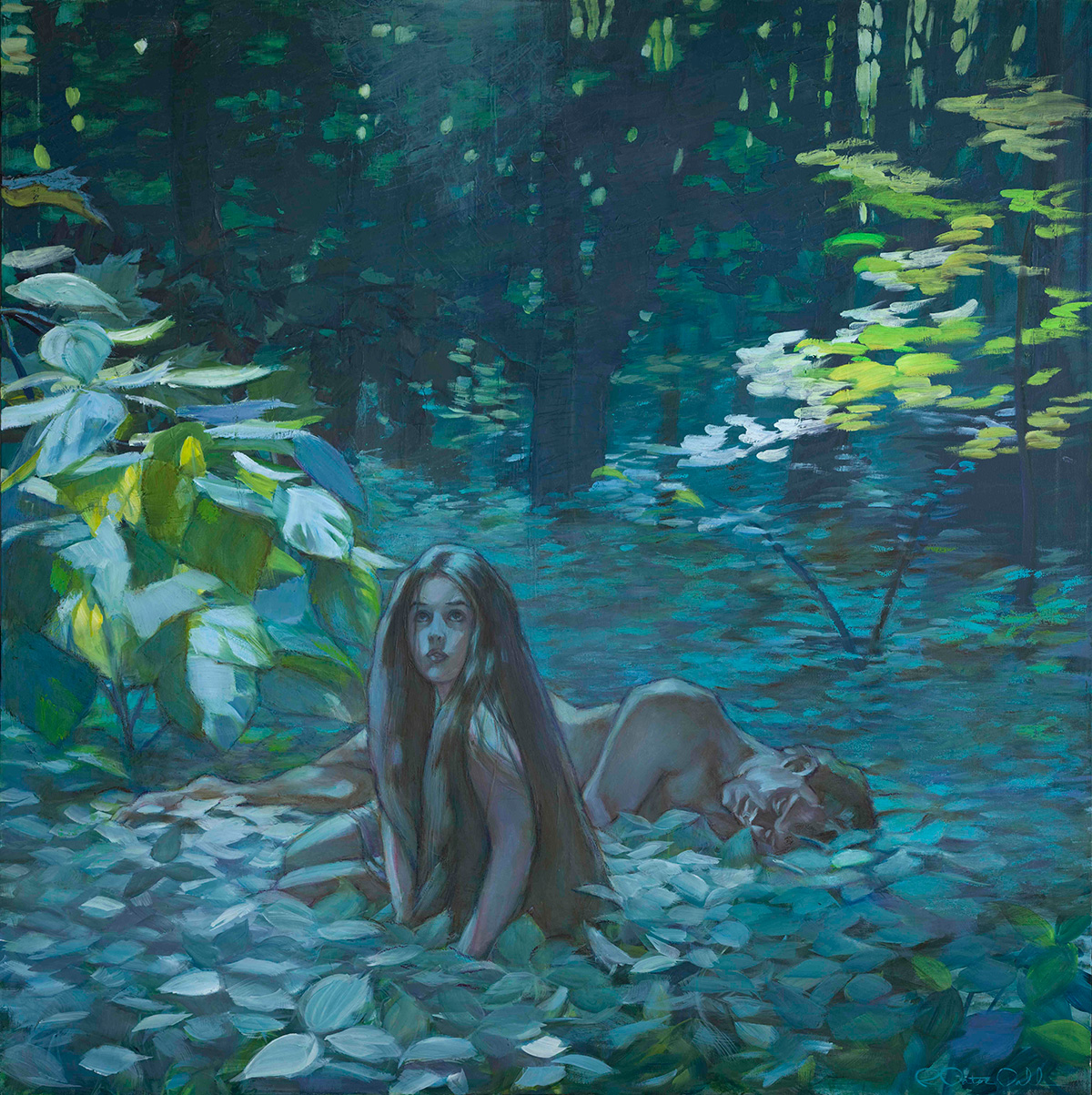
Using color to transform something ordinary into extraordinary is what excites me. I’ve had people ask me if there is a formula that I use, and the answer is “no,” not a formula per se, but a principle of visual balance. I love using complimentary colors, subtly, and boldly, consciously and unconsciously. I often let color become its own thing and just let the magic happen. A painting starts usually very carefully planned, a general vision of shapes, color relationships, and composition, but then I let it go, and hopefully it becomes an intuitive process. I am constantly nudging these color relationships as I lay down my strokes making sure as I go that everything jives correctly in the same ‘color universe’. Can I coin that phrase? I often use that term because my color universe does not necessarily relate to the natural world, but yet, I hope that the color universe created in each painting still manages to work. Moreover, it is really all about balance.

For example, a cool bluish skin tone can be balanced off by introducing a red or pinkish tone along an edge, or in the cheeks, the nose, or fingertips to give it warmth. I pay particular attention to lighting, throwing a cool temperature light on a subject, and then maybe balancing it out with a warm light coming from somewhere else if it needs it. That may be as close to formulaic as I get, but then I like to alter it, and maybe do things a little differently so as not to become old hat.

Surprisingly to some, my palette is kind of limited to a handful of dominant colors. That palette dominance may shift slightly from painting to painting, depending on the overall color scheme (for instance some paintings may be a mustard/pale blue scheme, or an orange/turquoise scheme, or maybe a crazy green/blush pink scheme) but largely I have my go-to colors. Remember, that all my color relationships MUST sit in the same color universe and let’s say introducing a color at random, that I haven’t introduced early in the process (just for the sake of riotous color) just doesn’t make sense. Simplicity, simplicity, simplicity. Keep with basics of form and color and shape. Keep your values, intensity and relationships of these tones in balance.

People have asked me if my pieces are watercolors. No, they are oil. But I often incorporate R&F Pigment Sticks (a buttery oil stick) because I love the color intensity in their pale tones, which can be hard to achieve when lightening up a color with titanium white or Permalba white which tend to gray or dull the intensity. Using R&F Pigment Sticks has the immediacy and effect of drawing with pastels, but rather it’s oil paint. Yummy, buttery oil. Think drawing with a tube of lipstick. (Okay, if you want to be technical, they are really encaustic pigments, but they blend will with oil paint.) There’s my nod to Edgar Degas, my first major art crush when I was age seventeen. The immediacy of which he laid down his strokes in his pastel work, his use of colors, his masterful rendering of figures, and his brilliant compositions, completely lit my fire and fueled my imagination. Henri De Toulouse Lautrec took this effect even further, and I have heartily embraced this approach to color.

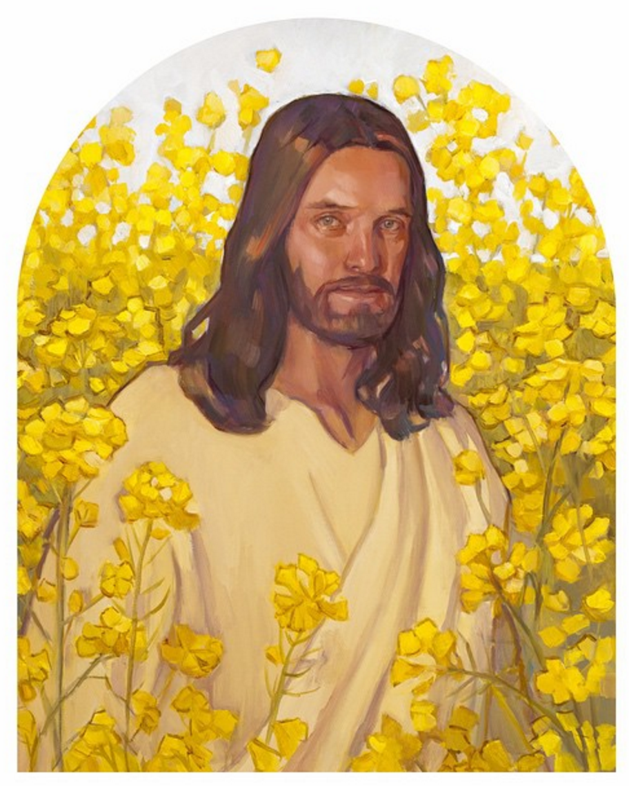
What’s next for you? I guess I am always working on several series at a time, in a continuum fashion. I will continue to paint images of Christ. Having painted multiple paintings from the ‘Early Years of the Savior’ (painted over a decade, from the viewpoint of a mother, Mary), I have moved onto ‘Christ’s Ministry Years’. At least twenty new images immediately come to mind. Who knows if I will live long enough to paint them.

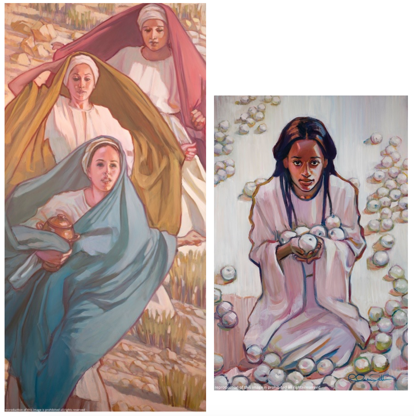
I also, of course paint women. Being a female artist, I relate to women. I am currently painting a series called ‘Girls in White Dresses’. These are girls and women of all ages and races. The series is about the purity of womanhood and girlhood, undiminished by stereotypes, removed from their association as sexual objects. These are real women, dressed in blinding white, in all their glory, and indomitable in spirit. With all that white, instead of exploring tonal values, I chose to use texture in a field of white on white, much like the effect of bas relief.

So what is next? What you will most likely see will have evolved from a continuum of images, and I hope new strains will emerge. And of course…. there will be LOTS… and LOTS… of color.

Visit Rose Datoc Dall’s website.

Follow Rose Datoc Dall on Instagram.

580 artist

Images courtesy Rose Datoc Dall and LDS.org.

Angel Moroni: Legacy of Sculpture

BCT-Angel-Moroni5

Guest Post: Brian Olson

Cyrus Dallin’s creation of the iconic Angel Moroni statue for the Salt Lake Temple did not begin the practice of placing a statue on every temple. Five temples would be built and dedicated as well as sixty-two and a half years would pass before another Angel Moroni Statue would be placed on a temple. This second statue, while keeping the horn and the upright position of Dallin’s Statue, would be as distinct from the Salt Lake Statue as that statue was from the Nauvoo weathervane. As construction commenced on the Los Angeles California Temple in 1951, Millard F. Malin was contacted by the Church about creating a new statue to go atop the new temple in a prominent California neighborhood.

Creating the Second Angel Moroni

Millard F Malin (1891-1975) studied sculpture at the National Academy of Design in New York City, chiefly under Herman MacNeil. Prior to that, he was a medical student at the University of Utah from 1914 to 1915 studying human anatomy. While a student in New York, Malin was hired by Gutzon Borglum to assist in sculpting the Confederate Memorial Carving at Stone Mountain in Georgia. Gutzon, who is best known for carving Mount Rushmore, was born in Idaho to LDS parents who soon after left the Church and moved to the Midwest. Malin opened his own art studio in the mid 1920’s in Salt Lake with the assistance of his closest friend, Edward O. Anderson. Anderson eventually became the chief architect for the Church and would call on Millard Malin to create the Baptismal Font Oxen and additional sculptures for the London England, Bern Switzerland, and Hamilton New Zealand Temples.

Malin’s Moroni, Angel in the City of Angels
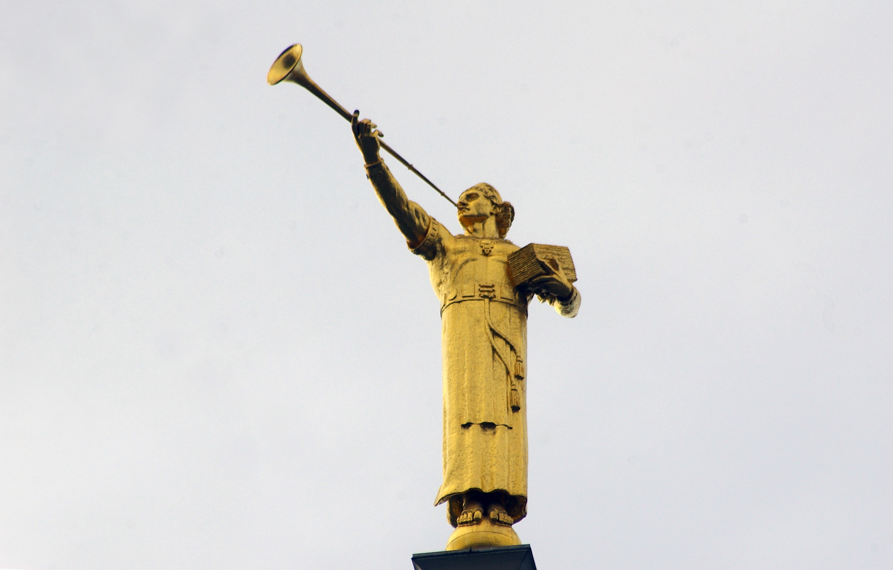
Malin

Designed specifically for the Los Angeles California Temple, Malin’s Angel (above) has not been used anywhere else. This Moroni was, according to the sculptor, heavily influenced by the Book of Mormon paintings of Arnold Freiberg, especially in regards to clothing and muscle tone. Besides the clothing, often described as Mayan in style, this statue has two other features not used on any other Moroni Temple statue to date. First is the manner that the right hand holds the trumpet, with the palm upturned and the trumpet resting in the hand. All other versions of the statue currently in use have the left hand palm down with a firm grip on the trumpet. Also, unlike all the other versions of the statue which feature bare feet, this statue wears sandals. This is also the first of two statues to be created for use on top of temples where the statue is holding gold plates in the crook of his left arm.

The Third Statue

The Los Angeles Temple Moroni was still not the start of the tradition of angels on the temples. The third temple to have an angel statue was the large new temple built in the U.S. Capital, Washington D.C. In the 18 years between the Los Angeles and Washington D.C. Temple dedications, the Church returned to the practice of building temples without statues. Five temples would be built and dedicated without an angel statue atop them. For this new temple, the Church would contact multiple artists to invite them to submit designs for a new statue to go atop the temple. Of the eight submissions the church received, they would choose the design of Avard Fairbanks.

Avard T. Fairbanks (1897-1987) was born in Provo, Utah to John B. Fairbanks, an artist famous for having painted murals in some of the early temples and a professor of art at the Brigham Young Academy in Provo, Avard T. Fairbanks comes from a family of artists. His brother, J. Leo Fairbanks was an artist like their father. Fairbanks’ son, Jonathan Leo Fairbanks is a sculptor in his own right and was curator of the Boston Museum of Fine arts in the early 90’s. Fairbanks’ nephew Ortho Fairbanks was also a prolific sculptor, creating many works as well. Fairbanks was a lifelong student and teacher. He studied sculpture at the Art Students League of New York, at the National School of Fine Arts under Jean Antoine Injalbert in Paris, and the Guggenheim Fellowship in Italy. He earned a degree from Yale University, a master’s degree from the University of Washington, and a Ph.D. in anatomy from the University of Michigan. He was an Assistant Professor at the University of Oregon, a teacher at the Seattle Institute of Art, an Associate Professor of Sculpture at the University of Michigan, and was the first Dean of the College of Fine Arts at the University of Utah. Fairbanks sculpted the friezes around the crown of the Laie Hawaii Temple, some of the sculptures on the temple grounds, and the oxen for the baptistry font. He also sculpted many works for Temple Square including busts of some of the prophets, the Restoration of the Aaronic Priesthood monument, the Restoration of the Melchizedek Priesthood Monument, and the Three Witnesses Monument .

Fairbanks’s Moroni, An Ensign to the Nations
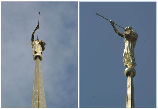
AF3

A new statue, a new style. Avard T. Fairbanks’s Angel Moroni is the only temple statue that has the trumpet pointing the same direction as the feet. All other statues have the trumpet and head turned at a right angle to the chest and feet. Like Malin’s Moroni, this angel holds a reproduction of the gold plates that the Book of Mormon was translated from nestled in the crook of his left arm. The robes on Fairbanks’ Moroni are long–longer than on any other Moroni. They cover part of the feet, well below the ankles. Most Moroni Statues have the robes end about or above the ankles. Originally, this was just an 18-foot statue (from feet to crown) for the Washington D.C. Temple. Later, three 15-foot versions were made to be used on other temples. The Washington D.C. statue is still the tallest Angel Moroni when measured from feet to crown.

The Fourth Moroni

Four temples would be built and dedicated in the time between the first use of the Fairbanks Statue until the first use of the fourth. Of those four temples, two used replicas of Fairbanks’ statue. By this point, there had been 20 temples built and dedicated. And of those 20, only a quarter of them had Angel Moroni statues. With the dedication of the Atlanta Temple in 1983 the statue came into regular use. And by regular use, I mean that 127 temples have been built and dedicated since then, and of those 127, only two did not receive a Moroni. Those two were both designed to have a statue, but due to legal issues, would wait to receive their statue until just short of one year after the dedication.

Additionally, since the construction of the Atlanta Temple, statues have been added to seven of the 15 original statue-less temples. In the foreseeable future, this trend will continue. As of writing, there are an additional 13 temples under construction, and two temples for which the Church has released the design. All of these 15 temples but one has been designed with an Angel Moroni statue. That one exception is the Paris France Temple, where a design choice is being considered to have neither spire nor angel. This would break a tradition running 30 years and including over 130 temples.

Torleif S Knaphus (1881-1965) studied under Harriet Backer at her Oslo school, under Lats Utne at the Norwegian National Academy of Craft and Art Industry, at the Académie Julian in Paris, and the Art Students League in New York.

His other works for the Church include assisting Avard T. Fairbanks with the oxen and sculptures at Laie Temple. He sculpted both the oxen in the Cardston Alberta Temple baptistery as well as a frieze titled Christ the Fountainhead. It stood outside the temple and was later moved inside the temple waiting room during a remodel and expansion. Copies of the frieze can be found in the waiting room at the Provo Utah Temple, on the exterior of the Edgehill Ward meetinghouse in Sugarhouse Utah, and various LDS chapels throughout the world. He carved the oxen for the baptismal font at the Mesa Arizona Temple as well as the eight terracotta friezes that run around the outside of the upper portion of the temple. He sculpted the oxen for the baptismal font at the Idaho Falls Temple and assisted with the oxen for the font of the Oakland Temple and the Moroni statue at the Los Angeles Temple.
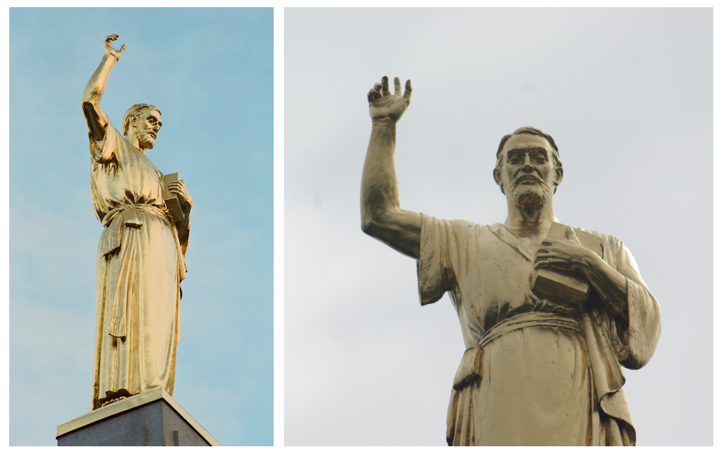
AM5

The work that Torleif is most famous for is the Hill Cumorah Monument (above), which was proposed by and entirely designed by Torlief Knaphus due to his great love for the restoration of the Gospel through the Angel Moroni.

Knaphus Moroni

Torlief Knaphus was asked to create a replica of the Dallin Moroni for use on the Washington D.C. Chapel in 1930. The statue is a foot shorter than Dallin’s original, and in regards to it, Knaphus said that while it looks the same from a distance the arms and shoulders are ‘beefier’ than the original. The statue was removed from the chapel in the 1970’s. A few years later an artist named LaVar Wallgren would recast the statue in fiberglass to be used on the Idaho Falls temple and a second recast to be used on the Atlanta Temple. The Idaho Falls statue remains, but the Atlanta Statue was removed, replaced with another model, then refurbished. It now sits on the Boston Temple. This Boston Statue, a recreation of the Dallin Statue, is on the temple closest to the Massachusetts home where Dallin lived for most of his life.

The Fifth, Sixth, and Seventh Moroni’s

While the Moroni tradition started mostly with the fourth statue, it was these later statues that made it possible.

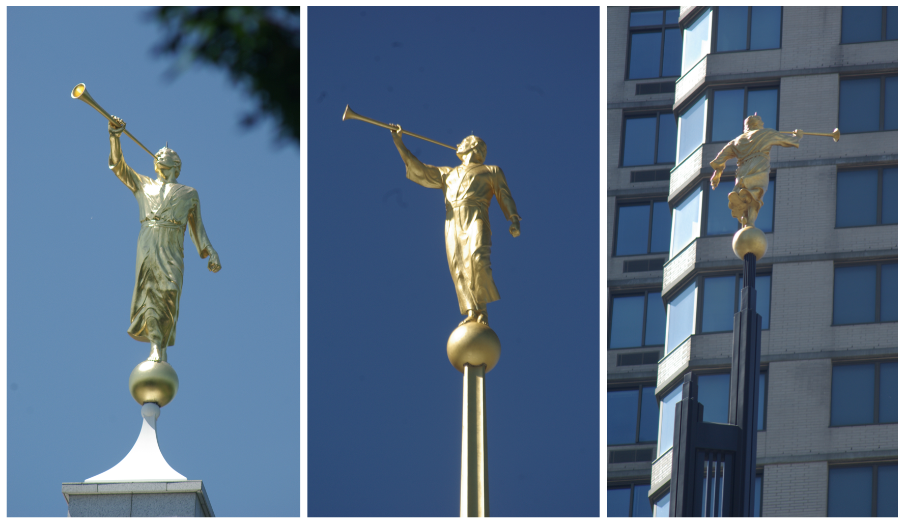
Karl Quilter (1929-2013) studied art and industrial design at the University of Utah and was mentored by Avard T. Fairbanks, sculptor of the third version of the Angel Moroni. While there, he and LaVar Wallgren experimented with casting sculptures in fiberglass instead of the more traditional metal. The effort was noticed by the Church, which would lead to the Church commissioning two statues for temples in the late 1970’s and eventually a third in the late 1990’s. Karl Quilter’s statues were lighter, easier to transport to locations around the globe, cost less to make, and could be lifted into place by smaller cranes or even helicopters. Additionally, they did not require the heavy structural reinforcement earlier statues required due to being cast from metals. This allowed for statues to be placed on smaller temples and narrower spires, including temples that had not been originally designed to have the statue. Later in life, Quilter would serve another mission for the Church, during which he sculpted the nativity scenes that are now seen on many temple grounds during the holiday season. Quilter’s three statues are often mistaken for one statue, or at best, three different sizes of one statue. But each statue is different with a unique pose. Here are the features of each statue that are unique.

Quilter’s 1982 Moroni. The quickest way to identify the first statue is to look at it from the front (below left). The hem of the robe on this statue is windswept and blows out and away from the feet to the viewer’s left. The statue’s left hand is held away from the body at a greater angle than the other two Quilter statues. The left wrist is bent down slightly. The robe on the left sleeve is smoother, devoid of defined wrinkles, and the cuff hangs round and loose on that arm. The left leg comes straight down from the waist and bends back at the knee, projecting forward slightly in front of the chest. Seen from the side, the left arm is bent forward at the elbow. The left hand is clenched in a fist. Close up, the right hand the fingers holding the trumpet are spaced apart, except the thumb which overlaps the pointer finger and touches the middle finger. This statue is 7 feet in height, foot to crown.

Quilter’s 1985 Moroni. Quilter’s second statue is 10’6″ feet tall (below middle). When viewed from the front, the hem of the robe hangs straight down from the waist, not being blown to either side. The left arm is closer to the body. The wrist on the left arm has no bend to it. The left hand is clenched in a fist in this statue as well. The left leg bends forward at the knee like the previous statue, but also bends slightly to the outside, emphasizing the left ankle being behind the right foot. When viewed from the side, there is no bend in the elbow. The cuff is tightly windswept and blown out behind the arm. On close inspection of the right hand, the fingers touch together and the thumb touches the side of the pointer finger without overlapping it.

Quilter’s 1997 Moroni. Standing at just 6’10” tall, this third statue of Quilter’s was sculpted primarily for the Nauvoo Temple (below right). The truly unique feature of this statue is the left hand. It falls down at the statue’s side like the two preceding statues, but unlike any other Moroni in use, the hand is relaxed and open. Another identifying feature of this statue is the robes. They have a heavier, more layered look, and appear far more disorderly and windswept than Quilter’s previous statues.
AM7

The Eighth Moroni

LaVar Wallgren (1932-2004), though not classically trained as an artist or sculptor, was asked to come up with a life-size Angel Moroni for the smaller temples, one that would be smaller than the other molds already in use. He knew upon being asked that it would have a scroll, like the angel mentioned in Revelation 14:6-7. He sketched then sculpted the new statue, which was approved by the First Presidency. The new statue was 5’ 11” with the face of a much younger man than the other statues. Originally intended to be white rather than gold leafed, the only white statue placed on the Monticello Utah Temple proved to be too difficult to see against the clouds. The Monticello Temple statue was then replaced with the 7 foot Quilter Statue. The subsequent statues were given gold leaf before being placed on temples. As a highly skilled craftsman who specialized in the casting of fiberglass, a skill he learned with Karl Quilter, Wallgren cast all of the Karl Quilter Angel Moroni statues in his Kearns, Utah studio.

Wallgren Moroni
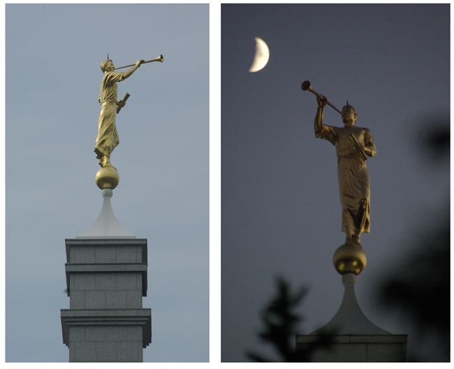
AM8

The Wallgren Moroni was designed specifically to use on the smaller temples and stands at 5’ 11 inches tall. It has two features that make it very unique. First and most obvious is the scroll the statue holds in its left hand. The second identifying feature is that the Moroni Wallgren created is far younger than any other Moroni statue. The face is clearly that of a younger more youthful prophet, rather than an older and wiser one.

This month we are featuring a four-part series on the Angel Moroni sculptures atop most of the Mormon temples around the world. These guest posts come from Brian Olson who has spent more than 10,000 hours modeling, digitizing, and photographing Mormon temples. His free PDF entitled Know Your Moroni can be found at Photogent.com.  Part One profiled Creating an Icon, Part Two profiled Sculpting Angel Moroni, and Part Four will look at Rendering Angel Moroni.

Images courtesy LDS.org and Brian Olson.
Jarom Vogel: Phantom Illustration

exorcism

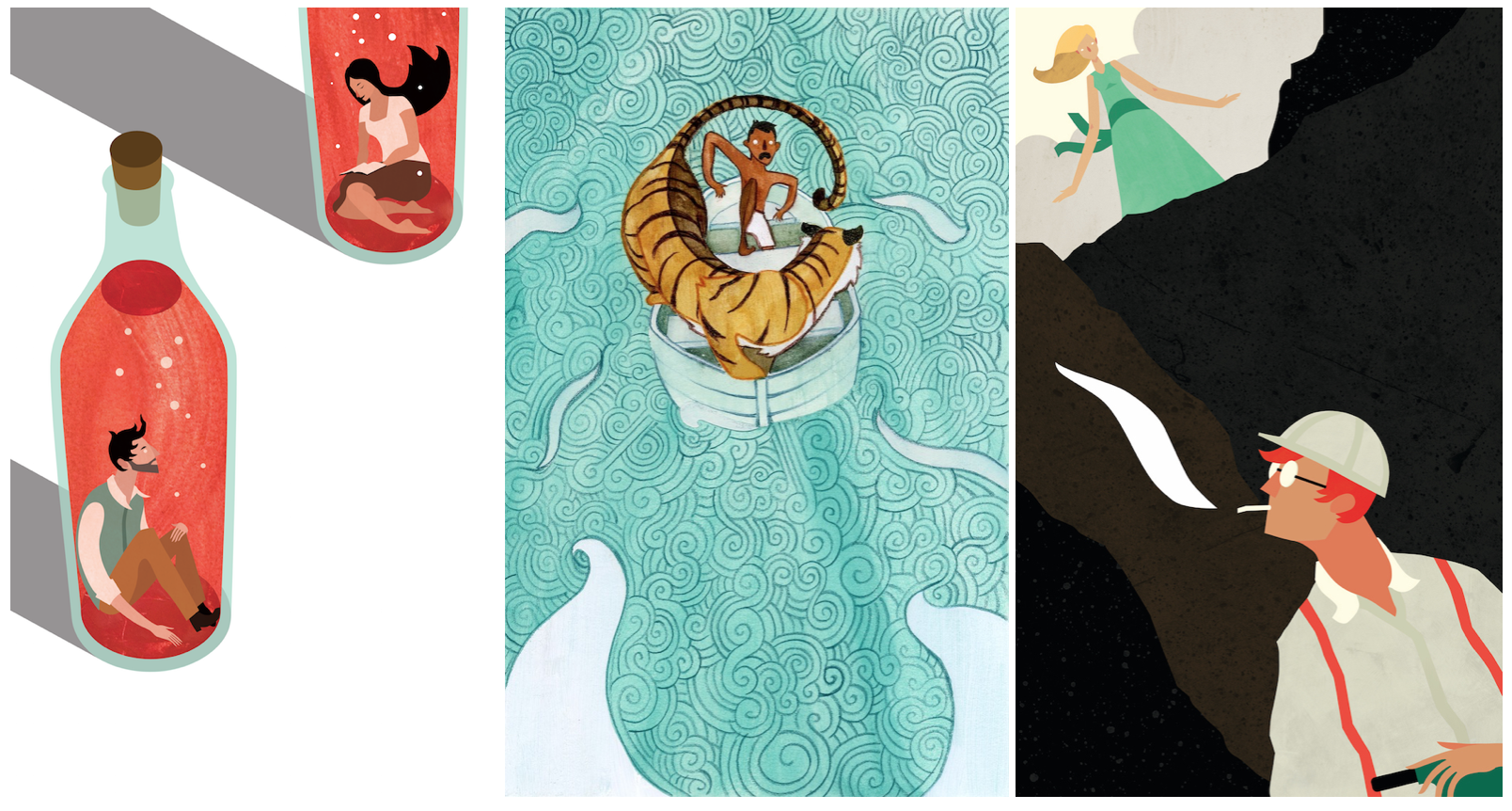
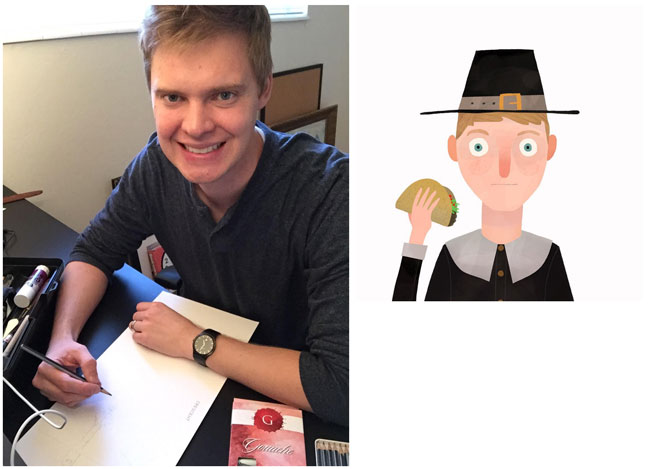
Jarom Vogel is an illustrator and digital artist from the BYU Illustration program. Although an aspiring dentist, he will not be following in the small footsteps of Hermey the Elf. He lives in Utah.  

JV2 Biking JV1

Tell us how you became an artist. I’ve always liked drawing – I think my earliest memories of it would be drawing during church (I’m sure I’m not alone in this on this site). I took art classes in junior high and high school and they were always some of my favorite classes. People seemed to think I was good at it (although looking back at some of that stuff, I’m not really sure why). I actually started out at BYU doing pre-dental courses and just took a few illustration classes on the side because I thought they would be fun. Gradually I ended up declaring an illustration major, got into the BFA program, and somewhere along the line decided I would hate being a dentist and gave up on that.

What do you think about ‘Mormon Art’? I have mixed feelings on this – on the one hand, I love the idea of my culture, heritage, background etc. informing my art. I mean, that’s a part of who I am, and I want that to show through in my artwork. On the other hand, I don’t really like the idea of being labeled as a ‘Mormon Artist’ because it seems like that limits what kind of work people expect from me. Not that I’m opposed to doing religious work – I would be really interested in exploring that at some point – I just don’t like the idea of always coming from that angle. I think it works really well for some people, but it’s probably not my thing. So I love the idea of Mormon artists, and I don’t think we should shy away from letting people know who we are, but I also don’t think that needs to define our artwork.

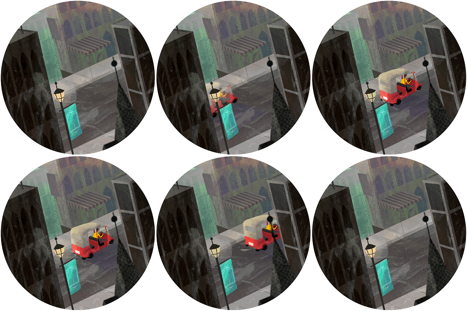
Talk about your Phantom Tollbooth project (set in India). I really love working with traditional paint media, but I’m also kind of a huge computer nerd so I end up doing a lot of digital work. The Phantom Tollbooth project was meant as a way to blend the feeling of acrylic paints with the benefits of digital art (below). I think there’s a certain impact of art that you lose when you move from traditional to digital, so the motion part was a way to try and compensate for that. You lose some color and vibrancy, but you gain motion, interactivity, things like that. I don’t know how successful it was in that sense, but it was fun to do. I had never really done anything with motion before, so it was a really great learning experience. The subject matter, the Phantom Tollbooth, is a book that I’ve loved since I was a kid and just wanted to do something with it. If anybody hasn’t read it, you really should. It’s super clever and funny.

milo dictionopolis infinity mountains

What are you working on next? I’m really good at starting projects and not finishing them, so I have a few different projects kicking around that maybe I’ll finish someday. I’m currently working on a stop motion project with some people (Trisha Zemp, Spencer Bugg, Ginger Dall, Madeline McKell and Chelsea Dalton – all very talented people). It’s a cut paper thing and is going to be really cool. That should hopefully be done by the end of the year. I’ve also been playing with the idea of making a children’s book app with some interactive illustrations and have a few bits and pieces of that floating around. I haven’t done much actual painting since graduating, so I’d really like to spend time getting some cadmium on my hands again.

Visit Jarom Vogel’s website.

Follow Jarom Vogel on Instagram.

JVJV

Linnie Brown: Visual Balance

An-Inhabited-Place

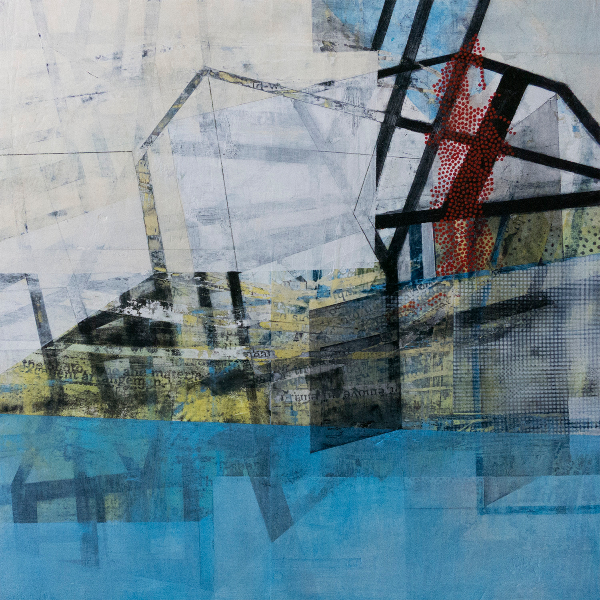
Linnie Brown is an adroit artist and teacher. Born in Portland, Oregon she graduated from BYU with a Bachelor of Fine Arts in Art and she earned an MFA degree at the University of Utah. Brown lives in Utah and teaches drawing at the University of Utah.

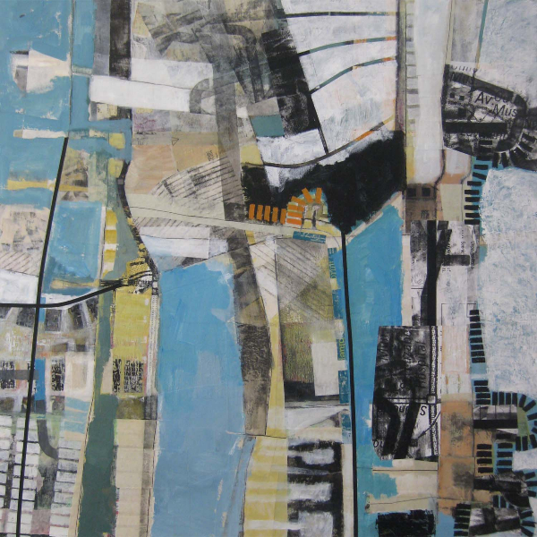
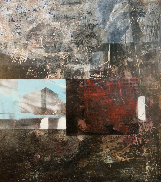
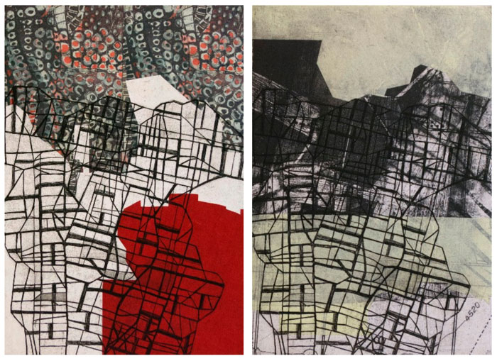
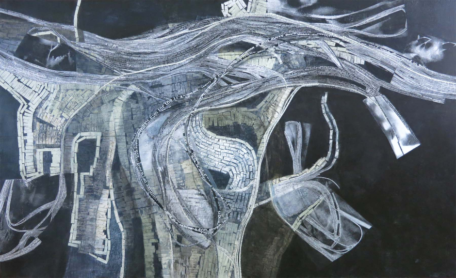
large format sketchbookto-seek-out-and-determine-the-location-of1 To-Deprive-of-Possession1 exurban Beneath-Built-Places LB2 A-Tactical-or-Strategic-Shifting

Tell us about your evolution as an artist. I studied painting as an undergraduate at BYU, and whether it was my instructors or my own personal aesthetic, I feel like I was always drawn towards abstraction. When I look back on my classwork, even still-life or figure drawings, I was cropping or simplifying elements so it was usually more about design and arranging shapes, values, and colors. In one class, we created and used stencils in our paintings. I was really attracted to the idea of being able to rapidly repeat and build up layers. I worked at a copy center at the time (with a great discount), and starting creating stencils from photocopies. After that, I transitioned into using photocopies and found paper directly as collage elements. Collage appealed to me, just like the stenciling had, as a way to quickly layer visual information.

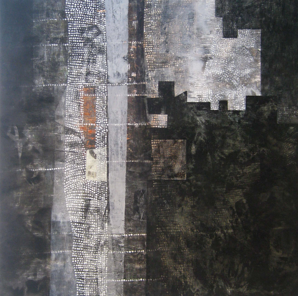
For a decade or so after college, my work dealt primarily with the idea of achieving visual balance. Meanwhile, I got married, taught high school art for a couple of years, had two kids, and made art part-time. Collage became even more important in my work.   I think a lot of that has to do with its physicality—it’s not an illusion of something, but it’s actually there, with distinct edges and depth. It can completely obscure what’s underneath or be sanded back by degrees to partially reveal previous layers. Each piece of paper also brings its own history with it, creating the potential for even more layering of ideas. I switched from oils to acrylic so I could incorporate collage at any point in the creating process. I went to graduate school at the University of Utah from 2013-2015 and that was a challenging (but good) experience for me. I questioned and re-established the ideas behind my art-making and had the chance to explore additional media.

You once wrote, ‘My artwork is based on the idea of achieving a visual balance between conflicting ideas and imagery.’ I would purposely start an artwork with imagery of two things that in my mind seemed at odds with each other: decorative patterns vs. tools, fossils vs. appliances, maps vs. plants, etc. Then I would rework, abstract, and layer those images until they fit together with some sort of resolution. The end image wouldn’t look like one thing or the other but would have morphed into something unique that was a little bit of both. The challenge of finding that balance and resolution was interesting to me, and I think also alludes to the idea of living lives that are full of this type of tension and negotiation. At what point do you change yourself to fit into circumstances, relationships, expectations, and at what point do they need to change?

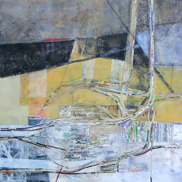
A lot of my previous work was directed at achieving this balance, particularly between natural and man-made imagery. Some of the recent, rapid growth in my community though, started to make me realize that my environment is not like this–it’s awkward, one-sided, fragmented, and unresolved. So that’s something I’m starting to explore more of-creating a sense of layers of human activity with less emphasis on the harmonious design.

Your work is so original. How do you get started on a new piece? My recent work deals with layers and patterns of development and how we move through developed spaces. I try to continually make/collect images dealing with those ideas so I have a library of sorts to use. I take photos of roads and construction sites in my area, look at Google Earth views, find maps of all kinds, and create elaborate on-going sketchbook doodles. When I’m starting an actual piece, I will usually quickly draw or collage one of those images I’ve found or created and then respond to it. My work is very process-oriented and intuitive, so from that point I’ll add collage or paint layers, scrape a few things back, paint or draw more, and so on—all depending on what I feel like the piece needs as I go. I may have a loose idea, like “all the back-and-forth driving this neighborhood does” or “how do I show layers of time in this space?”, but I never really have a pre-conceived idea of the finished piece.

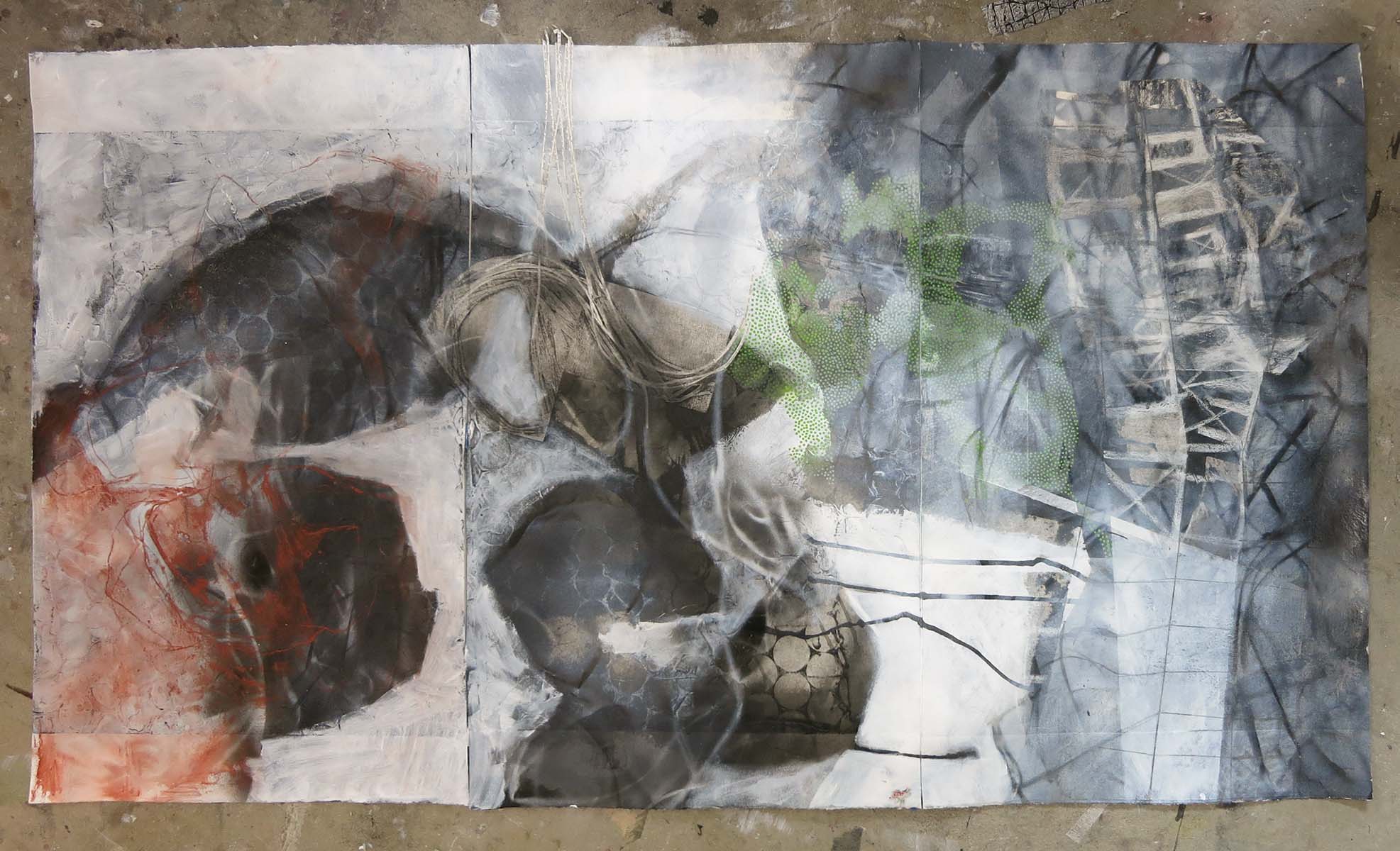
What’s next for you? I’m working on a collagraph project up at Saltgrass Printmakers in Salt Lake. The idea is that I will make a plate and print it. Then I will re-work and re-print the plate, repeating this process over and over again. Fragments of earlier states may remain visible or inform later choices, but there’s no going back once the plate has been changed. Each print will represent a fugitive moment in time, documenting the changing condition of the plate. Because collagraph plates can be constructed from so many materials, I kind of feel like I’m making a painting and documenting it as I go. Collagraphs are new for me so there’s a certain amount of trial and error involved. A second, side project will be a large-format folded sketchbook composed of all the “mis-prints”.

Visit Linnie Brown’s website.

Like Linnie Brown on Facebook.

LB1

Images courtesy Linnie Brown and Artists of Utah.

Salvador Alvarez: Joy in the Journey

joy-in-the-journey_grande

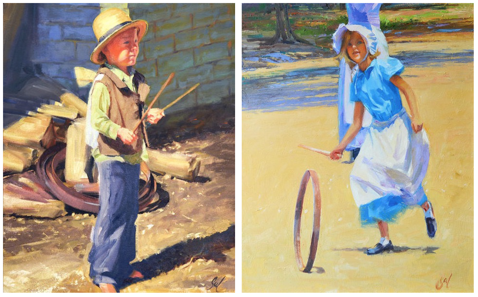
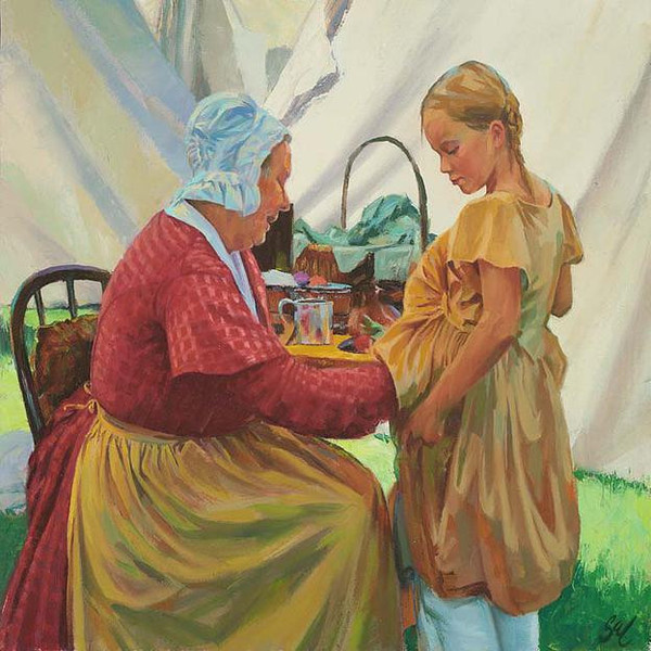
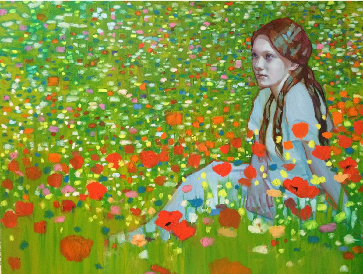
Salvador Alvarez received a burst of notoriety during the most recent LDS General Conference when one of his paintings played a prominent role in an address. He writes of his new series, “I am driven to make visible on canvas the history and the heritage of hope of a mighty and industrious people and I can see how each chapter of my life has given me the tools I needed to master the line, color, and form for the Joy in the Journey collection.” Alvarez lives in Utah.

the-pledge_e93b87e4-7d9b-4cec-8e7f-e65df937cd4a_grande the-weaver_grande SA1 the-dressmaker_grande friends_grande wooden-top_grande

Tell us about your evolution as an artist. Like most kids I started with crayons. In first grade I started drawing portraits of my classmates and never stopped. By fourth grade a teacher introduced me to Gray’s Anatomy and I started taking off on the human figure. I was a pretty intense kid and my mother always used to say that at age four I was already an old man. I had loving parents but they were not knowledgeable in the arts and never took me to an art gallery or museum. A door-to-door salesman had sold them a set of Encyclopedia Britannica and that became my window to the world of art. By the age of fifteen I started crashing life drawing classes at the local junior college, and yet ironically one of the only times I stopped art completely was the last couple of years of high school. I hated the art programs in my school and started taking drafting instead, which gave me a great foundation in perspective. I never grew up really thinking I would become an artist. I was just driven to make art. After high school I realized that art had been my one constant love and I realized I needed to get serious. I sought out Masters to apprentice under. I was fortunate to study under Stanihous Sowinski in watercolor and Sebastian Capella in oils and drawing. I traveled to Europe to stand before great canvases in person.
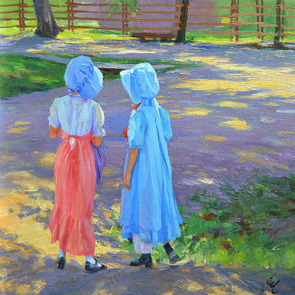
At the age of 24 I had what I can only describe as a ‘waking dream’. I was looking at a canvas and saw through it into a place where I was shown what I had to do. The dream was about the pursuit of excellence. Everything was laid out for me in a way that seemed so simple at the time. I was told that I had very little knowledge, but great enthusiasm so I had to go as fast as I could because later I would have great knowledge but not as much enthusiasm. I was also told that it would be late in life when I would come into my own. A few years after that dream I was awarded a full scholarship to the Masters Program at the New York Academy of Art. That was a time of great awakening. After I completed my studies in New York I headed to Paradise (North Shore of Oahu, Hawaii) to raise my family and concentrated on painting the ocean, the colors of the Islands and did hundreds of portraits. Family circumstances brought me back to Utah where I started working on the “Joy in the Journey” collection.
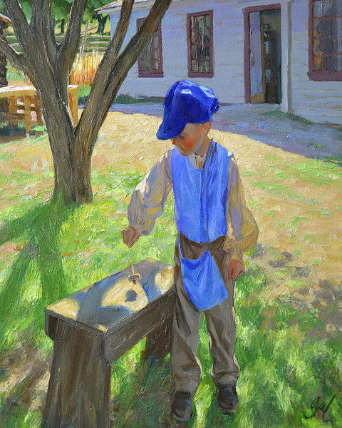
Your artwork was a central feature of one of Dieter Uchtdorf’s recent General Conference addresses. Last year I had an opportunity to debut the collection, which celebrates the joy, hope and faith of the pioneers who journeyed west. These are paintings that are meant to put a smile on your face. President Uchtdorf and his wife Harriet came by and fell in love with them. When they saw the collection they smiled from ear to ear, then just a few weeks before this past General Conference I received an email asking if President Uchtdorf could use the signature painting Joy in the Journey (top) in a conference talk. Of course I said Yes, but I had no idea if or how it would be used. When he used it for the Great Aunt Rose Parable I pretty much went into shock. The response was immediate, and although there was no attribution, thousands of people started asking whom the artist was and where they could get a copy. Word is getting out. Our plan had always been to put the collection into print, but this accelerated things in a miraculous way. We now have a website up and prints in production. The collection consists of eleven now, but I am adding pieces constantly.
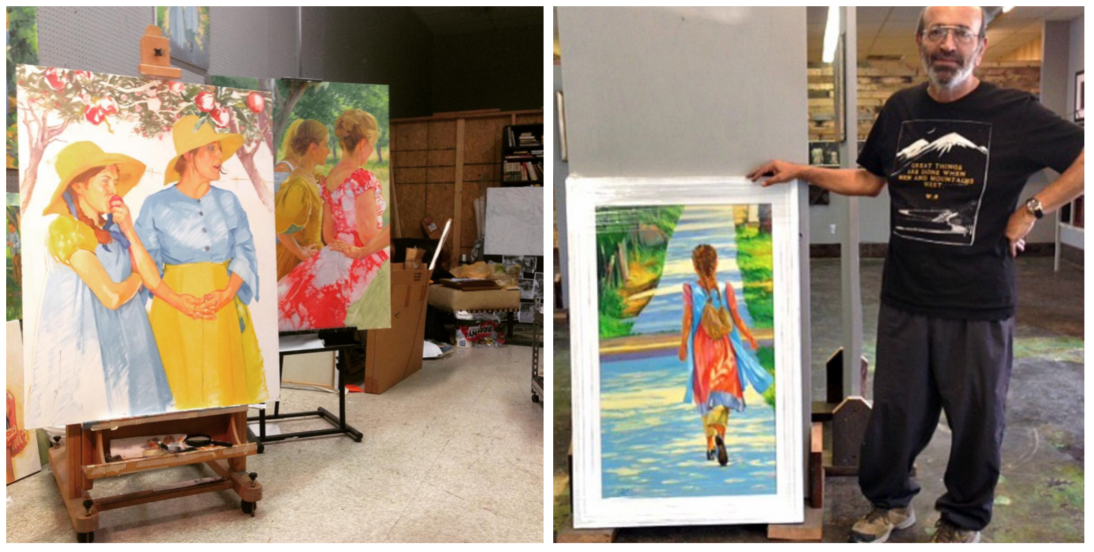
What’s next for you? After sixty years of hard work behind me I am now an overnight success. I can see that dream from years ago coming true. I hope this will give me more freedom to create wherever my heart leads me. The pioneer collection will continue because I enjoy each one I do. I may pursue formal portraits and then there is that epic collection that has been in my brain for years…The Colossus Collection.

Visit Salvador Alvarez’s website.

Follow Salvador Alvarez on Instagram.

SA