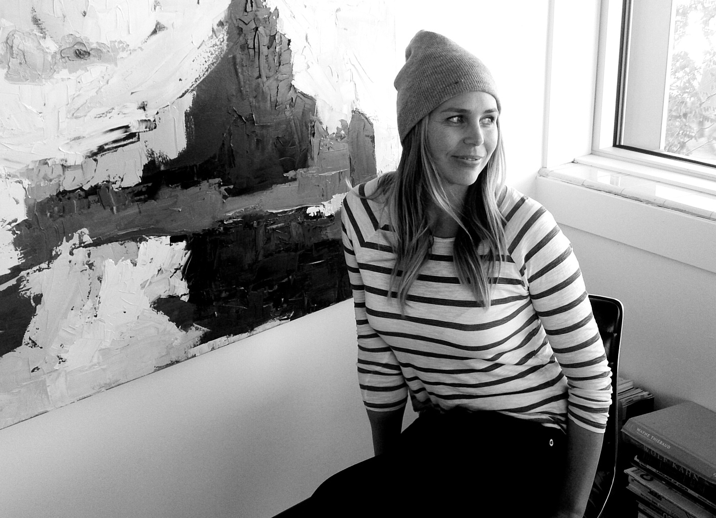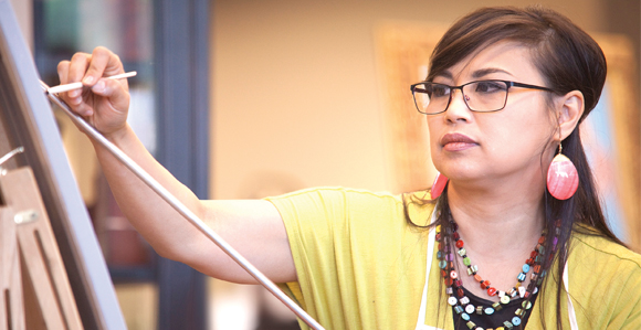
Chelsea Steinberg Gay is a sculptor, welder, artist, and creative soul. She received a BFA in Sculpture from SUNY Purchase. As she explains, “In the last three years I have been focusing on my own ancestry: generations of Jewish European immigrants, Holocaust victims and survivors, and life-long New Yorkers. I often work from my memories of growing up Jewish, in the city. Against this background of Jewish themes and issues, my most recent work has been an inquiry into the culture and religious practices of the Church of Jesus Christ of Latter -day saints into which I married and converted. I examine orthodox Mormonism through the lens of the secular, socialist Judaism in which I was brought up, never fully immersed in one world or the other.” Gay lives in New York City.
Tell us about your evolution as an artist. I started taking art classes regularly around age 12, in Brooklyn, New York, where I was born and raised. I learned from friends’ parents, from hanging around movie sets where my dad was working as an electrician, where I shadowed scenic artists, and from public school art teachers. I went to the Brooklyn museum for classes as both a toddler and a teen. I was accepted to LaGuardia High School as an art major, and from that point onwards I was making art full-time, both in studio classes at school and whenever I had a spare moment. I started welding classes at age 15 and made a little steel sculpture that got me into the art program at SUNY Purchase. When I wasn’t on campus there I was making sculpture in my parents basement and taking classes at the Art students league or the Compleat Sculptor. I tend to forget how much formal art training I’ve had over the years, when I was hunting for MFA programs I was sort of stunned at how poor many really notable schools facilities were; Purchase really spoiled me, especially when it came to bronze casting. I learned all that I know and do now at Purchase, I owe those professors a huge debt of gratitude. My bronze castings keep my lights on, which in turn allows me to do whatever I please in my studio. I used to scavenge for weird or unusual objects, and I really like thrift shops and consignment stores. My grandfather is a bit of a hoarder, and I made some of my first sculptures on his farm in South Carolina when I’d visit, since he had mountains of every conceivable bit of fascinating trash, from cast glass perfume bottles in the shape of ladies in fancy dresses to a full-size school bus that was inhabited by countless hornets, decaying on the side of a dirt road near where he kept his goats. His cows ate out of a giant abandoned tire, which held their feed amazingly well. I think that the urge to find and use some kind of relic or prop, or to make something that feels like such an object is at the root of a lot of what I do. A professor once told me that I’m an object-maker at heart, which I think is essentially true. I also like installations and performances, but on a day-to-day basis I tend to make objects. Beauty is crucially important to me. Another professor taught me that your art has to strike at the gut—hit the primary impulse first, the secondary, cognitive, impulse second. If something is visually appealing, not necessarily cute or pretty, but satisfying to look at I think of it as successful. I’ve evolved from someone who had no particular direction, to someone who works towards an idea of making something that satisfies certain requirements, that it is visually provoking, stems from a genuine place and has a strong sense of self as an object – if an object can have that sense…I like the finished works to have a kind of personality, to be true, even if that truth is only in the act of yearning to be true, or of the truth inherent in questioning to reveal something genuine.
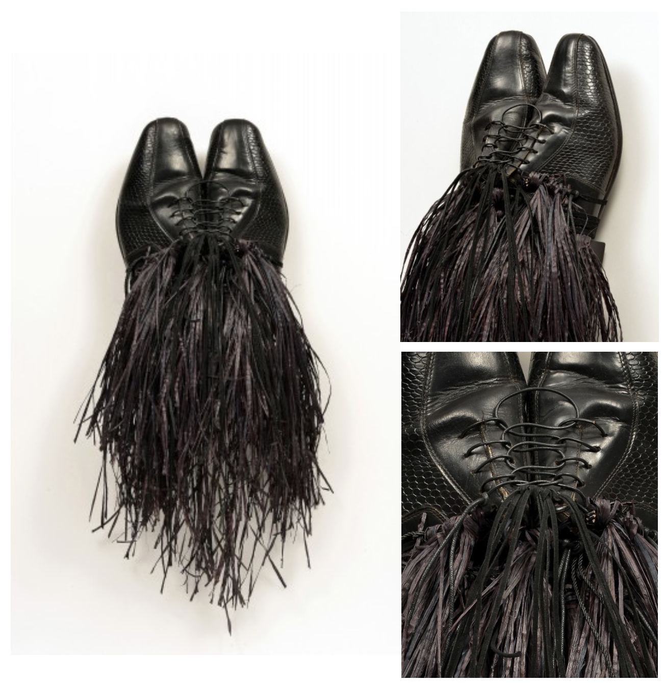
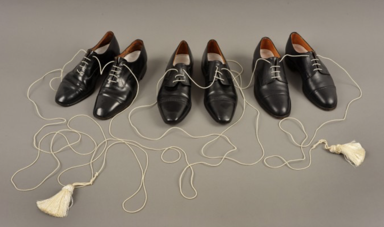
You once wrote, “I am working to create a visual language, which makes Latter-day Saint symbolism more accessible to others.” I wrote this for a failed application to a graduate school program, then I put the whole thing on my website because I liked the way it flowed together. That is just one of the aims of my work, but it’s probably the most convoluted. I suppose the question I might get from people would be why even bother? The Church goes to great lengths to make its concepts very simple and clear. As an international organization that does significant work in developing countries, this simplicity is paramount. The symbolism I’m talking about has been represented in countless ways – take my “Righteous Priest” Masks (above). Literally, you could represent the idea of the priesthood with historical paintings or images of men – or women – giving blessings. But that’s not really the kind of visual language I’m talking about. The best creators of new languages take you away from the familiar into their own realities – Joseph Beuys and his visual language, for example, where each material he used was imbued with a special symbolism that was connected to an origin myth that he created, or Anthony Burgess, who created the language used in the film Quest for Fire, or in his book A Clockwork Orange. These were artists and writers who sought to speak their own truth by pulling their audience out of a literal space and into a symbolic one, and to my thinking that makes their work all the more rich and thrilling, albeit demanding and sometimes alienating. So, to look at my “Righteous Priests” through that lens of a visual language, what is there now? African mask references, men’s dress shoes, (worldly claim to authority, where one stands, where one is grounded), a hierarchy of materials… everything this represented symbolically, visually, the concepts are virtually all LDS. In terms of the reference to African masks, there is the issue of race and the priesthood, and the inexcusable history of the church barring men of color from holding the priesthood. As it happened, the church is inextricably tied to Africa for me, as that is where my in-laws served a mission, it is where my husband works as a humanitarian aid professional, and it is where I found myself seeing the church’s humanitarian work, which broke down some of the barriers in my hardened, acerbic little heart. The challenge of creating a visual language that makes LDS more accessible to others is all about how successfully the piece is executed. Ideally, a beautiful or fascinating object will draw a viewer in, and have them asking questions, in a way that a literal or figurative work of art can’t always do. The work doesn’t have a goal to bring people to any one perspective, but to take these concepts – a priesthood on earth, laden with all the complications of being humans on the earth – and to hold up a prism to the ideas, allowing them to refract and allow for people to bring in their own perspectives on the subject, to find their own way in to the concept at the heart of the work.
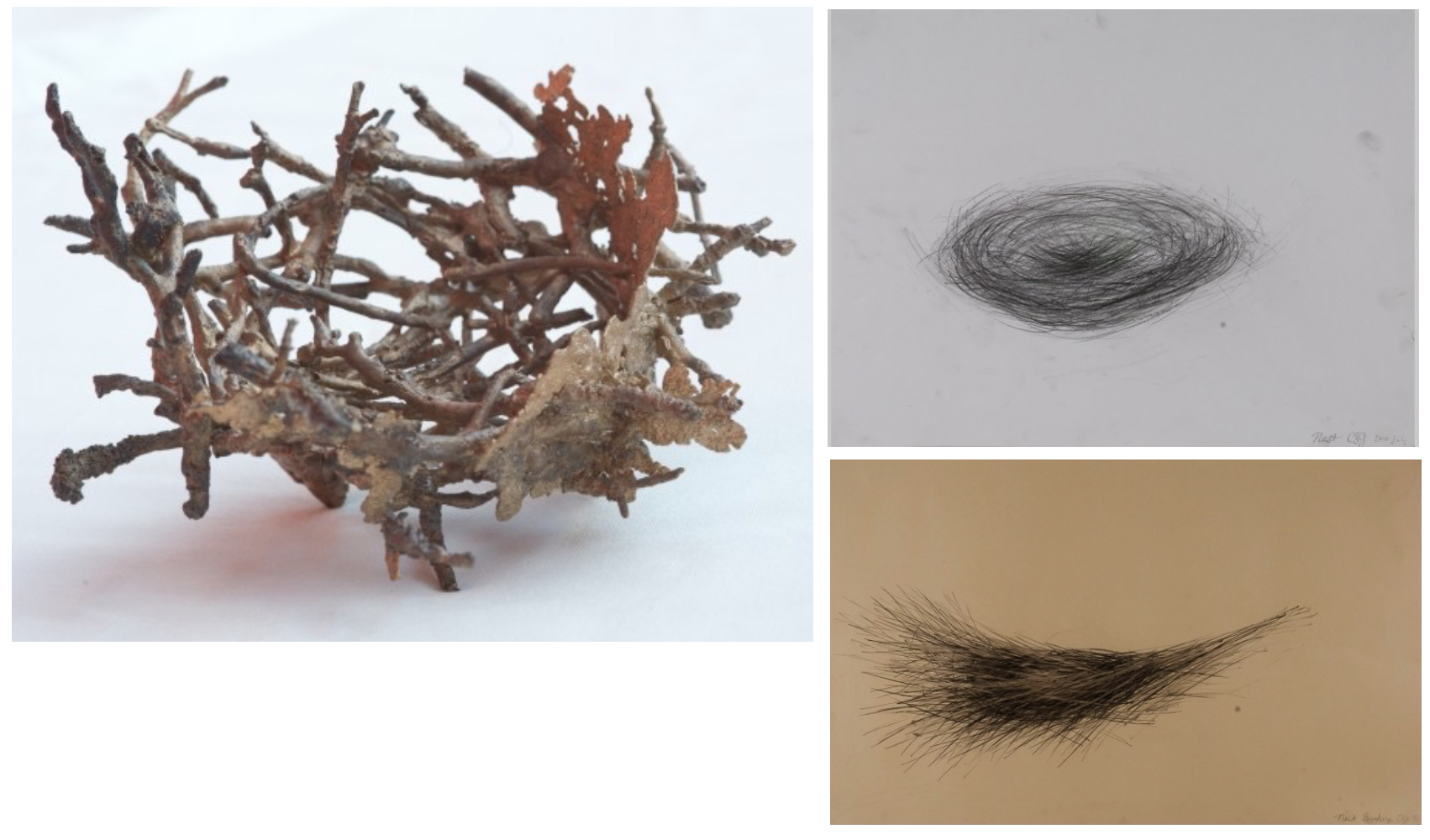
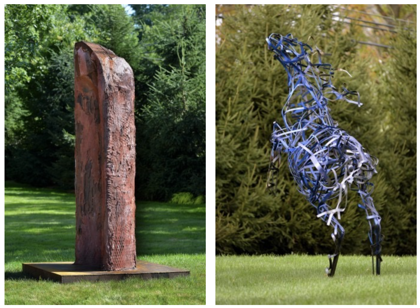
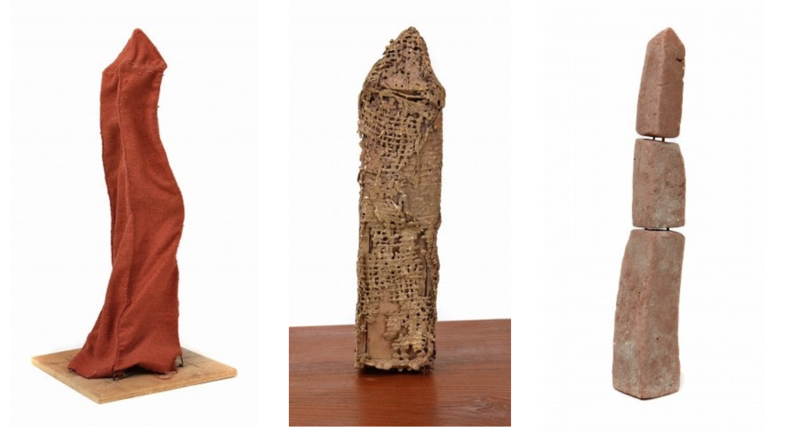
The nest and the obelisk are recurring images in your work. What reverberates with you regarding these? The nest is pretty literal for me. I made the first of my nests to cope with transitioning into motherhood. I had a lot of people telling me I was at the end of making art, since I was going to be a mom now. Those people were idiots, but I was scared enough of losing myself in motherhood that I started to make nests, trying to think about the concept of being the head of a family, of being a parent, of managing a household, and how the women before me had done it…I had no idea, but it was a good way to kill a bit of time before the baby came, and in the end people responded really strongly to the nest. A friend of mine makes them also, for the same reason – people like them, they sell…everyone’s got to pay the bills. On a deeper level, though, how many mother-artists are there, really? When you look at the impossibility of being an artist, and then dump being a mother on top of that, it’s a lot to manage, and many people don’t make it work. Many do, also, but they’re often mum on how it’s done. So the nests are about mother-anxiety, about home making, and puttering around and finding balance…until the nest is done, and the babies fly and you get a cat. As for obelisks, I really fell in love with them because of Edward Gorey. My parents house in Brooklyn is a block away from Greenwood Cemetery, and there’s obelisks in there too. Something about them is deeply satisfying, visually. I did some homework and found out that the obelisk predates the cross, that they’re originally from Egypt, but are also in Ethiopia, which I visited years ago with my husband, and fell madly in love with, and that there are also plundered obelisks amidst sunken ship wreckage at the bottom of the sea. They’re staggeringly beautiful in person, and the concept behind them is the ascent to God. The line draws your eye up to the heavens. The cross was the intersection of that vertical infinity of God and the horizontality of human death. I like the former concept, also, as a Jew I struggle with crosses a bit. I may have converted to the LDS church, but I’ve never been able to help being a Jew, just look at the first part of my surname, it’s my ethnicity, being a native New Yorker only exacerbates it. The obelisk feels ancient in a way that is thematically safe, in a pre-Christian way. Suffice it to say, I’m more comfortable in my Jewish-themed work than I am in my Mormon-themed work.
What’s next for you? I do very little showing, maybe twice a year in very unglamorous circumstances, because I’m fortunately swamped with commissions or children most of the time. I spent a couple years looking through all these graduate programs for fine artists, and when I finally thought I found a great fit, they didn’t accept me. Once I started chatting with MFA students regularly I realized that I wasn’t really into the idea of a fine art graduate program, I mean, I’m not desperately in need of studio art classes, and I’ve been working consistently for well over a decade, what I needed was to be better researched on my subjects, lucky me I got accepted to a grad program in Jewish Art and Visual Culture at the Jewish Theological Seminary of America. I began a series a few years ago on my paternal Ashkenazi lineage, on being a New Yorker, and a Jew and all the complications of that, I made Emet – my golem – based on an old legend out of Prague, but when I went to further my research to make new work I hit upon a series of barriers, the least of which was language. JTS is getting me through those barriers and giving me fuel for the next thing, which is not only to continue examining the Jewish/Mormon intersections that I find so interesting, but also to dig deeper into my Jewish roots. If it wasn’t for the sense of a loving God that I found as a Bat Mitzvah student and Camp Kinderland kid, I’d never have joined the church in the first place, and if I hadn’t joined the church, I doubt my yearning to understand my mother religion and culture (well, one of them, my mother is Southern Baptist, descended from Scotch-Irish and Pennsylvania Dutch immigrants,) would be nearly as strong. So I’m getting my MA, and I’ll be taking my family with me when I do my internships at museums, hopefully one in Tel Aviv and one in Prague, and I’m going to keep making art all the time, it’s been just about 20 years of me making art, I’m not really interested in quitting now, God willing, I can keep it up, and maybe show and sell a bit, too.
Visit Chelsea Steinberg Gay’s website.
Donate to Gay’s husband’s non-profit (Engage Now Africa) to raise money for the women and children they are helping to escape from slavery and human trafficking in Uganda, Ethiopia and Ghana.